
Maximising user engagement through meticulously crafted website layouts is not just about aesthetic appeal, but it’s also about fostering an intuitive and seamless user experience. Effective layouts serve as the backbone of a website, guiding users effortlessly towards the information they seek and actions they wish to take. Here are some refined strategies to enhance user engagement through your website design:
- Structured Visual Hierarchy: Implement a well-defined visual hierarchy to intuitively guide users through your content. Utilise size, colour, and positioning to emphasise key elements, ensuring that users can effortlessly locate and process information.
- Uniform and Intuitive Navigation: Consistency in navigation design is crucial. Ensure that menus, buttons, and links are uniform and easily navigable across all pages. This approach minimises user frustration and enhances the ease of exploring your site.
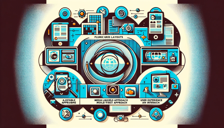
- Adaptive Responsive Design: Given the diverse range of devices used for web access, responsive design becomes indispensable. Your layout should fluidly adapt to various screen sizes, maintaining its usability and aesthetic integrity across all devices.
- Strategic Application of White Space: White space, or negative space, is much more than mere emptiness. It’s a critical design element that helps to segment content, aids readability, and focuses attention on pivotal elements.
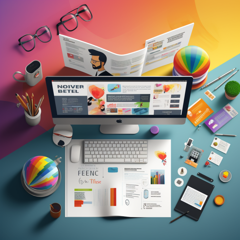
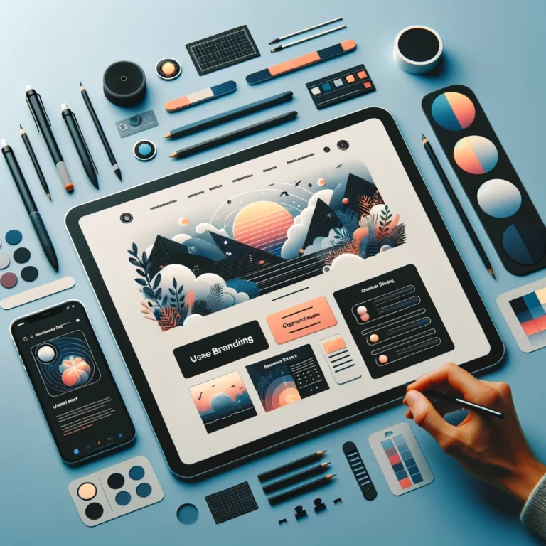
- Captivating Visual Elements: Integrate high-quality, relevant imagery, videos, and graphics. Effective visual elements can quickly grab user attention, making your website more engaging and memorable.
- Seamless User Flow: Engineer a logical and intuitive user journey, guiding visitors from their initial interaction to the completion of desired actions, like purchases or sign-ups. Each webpage should naturally lead to the next phase in the user journey.
- Prominent Call-to-Action (CTA) Buttons: Employ CTAs effectively to prompt user interaction. Strategically place them in locations that naturally draw the user’s attention, ensuring they are noticeable without being overbearing.
- Optimised Readability: Choose fonts and colour contrasts that enhance readability. Avoid monolithic text blocks by incorporating headers, bullet points, and interspersed imagery, facilitating easier content consumption.
- Swift Loading Times: Fast-loading webpages are key to keeping users engaged. Optimise your site’s elements, including images and scripts, to ensure rapid loading times, thus reducing the likelihood of increased bounce rates.
- Interactive Features: Incorporate dynamic elements like hover effects, scroll-triggered animations, or interactive infographics. These features can significantly enhance user engagement and impart informative experiences.
- Inclusive Accessibility: Design your layout with a focus on accessibility, making it user-friendly for individuals with disabilities. This includes keyboard navigability, screen reader compatibility, and adequate colour contrasts.
- User Feedback Integration: Create mechanisms for user feedback, such as surveys or comment sections. This feedback is invaluable for understanding user interactions with your layout and for making ongoing enhancements.
Maximising User Engagement, The Conclusion
By focusing on key elements of website design, you have the opportunity to create a website layout that is both visually stunning and highly effective in engaging users. This approach is not just about aesthetics; it’s a strategic alignment of design and functionality that leads to a more fluid and satisfying user experience.
Visual appeal is the initial hook that draws users in. A well-designed website uses colour, imagery, and typography in a way that is not only pleasing to the eye but also aligns with the brand’s identity. The choice of colours can evoke emotions and set the tone, while high-quality imagery and thoughtful typography can make your content more digestible and engaging.
However, visual appeal is just the starting point. The real magic happens in the seamless integration of user-friendly features. A clear and consistent navigation structure allows users to move through your site intuitively, with minimal effort. This ease of navigation is crucial in keeping users engaged and reducing the bounce rate. Incorporating responsive design ensures that your site is accessible and appealing across all devices, from desktops to smartphones, thus catering to a wider audience.
The strategic use of white space is another critical aspect. Far from being mere emptiness, white space is a powerful tool in design. It helps in organizing content, improving readability, and focusing user attention on the most important elements of your page. This thoughtful spacing can transform the user experience from cluttered and overwhelming to clear and enjoyable.
Interactive elements like hover effects, animations, and clickable items add a layer of engagement to the user experience. They make your site dynamic and can effectively guide users to take specific actions, such as subscribing to a newsletter or making a purchase. These elements, when used judiciously, can significantly enhance the interactivity of your website without being distracting.
Accessibility is another vital component. A website that is accessible to all, including those with disabilities, not only broadens your audience but also demonstrates social responsibility and inclusivity. Features like keyboard navigation, screen reader compatibility, and adequate contrast ratios are essential for ensuring that everyone can use your site effectively.
The inclusion of clear, compelling call-to-action (CTA) buttons is crucial in guiding users towards desired actions. Whether it’s signing up for a newsletter, downloading a resource, or making a purchase, well-placed and well-designed CTAs can significantly increase conversion rates.
Moreover, the readability of your content plays a significant role. Choosing the right font size and style, breaking down content into manageable chunks, and using bullet points or lists where appropriate, all contribute to a more enjoyable reading experience.
Finally, the speed at which your pages load is critical. In an age where users expect instant results, a slow-loading website can be a major turn-off. Optimising images, streamlining code, and leveraging caching are just a few ways to ensure your site loads quickly and smoothly.
By incorporating these elements into your website design, you create more than just a visually appealing website; you create an environment that is user-friendly, accessible, engaging, and effective. It’s a holistic approach that ensures users not only visit your site but also enjoy the experience, stay longer, and engage more deeply with your content. This focus on both form and function is what ultimately leads to a truly satisfying user experience.
We also have an article on our blog post site that might be of interest. Creating an Effective Landing Page: Tips and Techniques