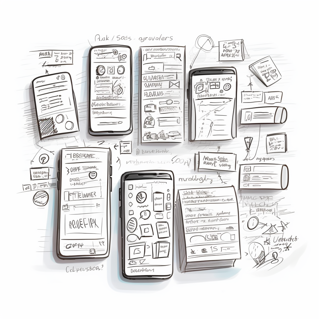
Building a mobile responsive website? the ability to adapt is crucial, especially in the realm of web design. As users increasingly access websites from a diverse array of devices, each with different screen sizes and resolutions, the importance of responsive web design becomes paramount. Responsive design ensures that a website provides an optimal viewing experience—easy reading and navigation with minimal resizing, panning, and scrolling—across a wide range of devices. This article delves into five essential practices for creating responsive websites, ensuring they work seamlessly whether accessed from a desktop, tablet, or smartphone. By embracing these practices, designers can create versatile and user-friendly websites, ready for the digital demands of today and tomorrow.
1. Fluid Grid Layouts
The foundation of any responsive website is its grid system. Traditional web design relied on fixed-width layouts, but this approach falls short in today’s diverse device landscape. This is where fluid grid layouts come to the rescue. A fluid grid layout uses relative units like percentages, rather than fixed units like pixels, to define the size of elements. This flexibility allows the layout to adjust and adapt to different screen widths.
Imagine a three-column layout on a desktop; on a smaller screen, these columns might become too narrow to be practical. A fluid grid would enable these columns to adjust their width or stack vertically, maintaining usability and readability. The key is in the mathematics – rather than dictating specific dimensions, designers define proportions. For instance, if a sidebar is meant to take up one-quarter of the screen width, setting it to 25% ensures it maintains this proportion regardless of the screen size.
Key Points:
- Advantages of Fluid Grids: They provide a more adaptable foundation for your design, ensuring content looks good on any screen size.
- Implementation Tips: Start by dividing your design into a grid layout. Assign relative units to elements, and test across different screen sizes to ensure consistency.
- Examples: Showcase examples of how fluid grids work in real-life scenarios, perhaps comparing a fixed layout with a fluid one to illustrate the difference.
Fluid grid layouts are the backbone of responsive design, enabling content to flow smoothly across various screen sizes. This adaptability not only enhances user experience but also ensures your website’s design is future-proof, ready for new devices and screen dimensions.

2. Flexible Images and Media
One of the biggest challenges in responsive web design is ensuring that images and media content also respond to different screen sizes. This is where the concept of flexible images comes into play. The goal is to have images that scale within their containing elements to avoid breaking the layout or taking up too much screen real estate on smaller devices.
The most common technique to achieve this is to use CSS, specifically the max-width property set to 100%. This simple line of CSS ensures that the image will never be larger than its container, allowing it to scale down on smaller screens. For more complex scenarios, such as high-resolution displays, designers can use media queries to serve different image sizes. The srcset attribute in HTML5 is also a powerful tool, allowing the browser to choose the most appropriate image size based on the screen resolution and download speed.
Key Points:
- CSS Techniques: Utilize CSS properties like max-width and height: auto to ensure images resize within their containers.
- Responsive Media Embeds: For videos and other media, consider using aspect ratio boxes to maintain the correct size and proportion on all devices.
- Best Practices: Discuss the balance between image quality and load times, emphasizing the importance of optimizing images for faster downloads.
3. Media Queries
Media queries are the cornerstone of responsive design, allowing designers to apply different CSS styles based on the device characteristics, most commonly the width of the browser. Media queries can change the layout for different screen sizes, adjust font sizes, switch images, or even modify the navigation of a website to better suit the user’s device.
A typical use case might involve changing a multi-column layout to a single column when viewed on a mobile device. Similarly, text sizes might be increased for readability on smaller screens. The flexibility of media queries means that designers can tailor the experience to suit not just a range of devices, but also different orientations, like landscape or portrait mode on tablets and smartphones.
Key Points:
- Basics of Media Queries: An introduction to writing media queries and understanding breakpoints.
- Example Use Cases: Provide practical examples of media queries in action, such as adjusting layout columns, resizing text, and altering navigation.
- Common Breakpoints: Discuss the most commonly used breakpoints for devices like smartphones, tablets, and desktops, and how to choose breakpoints that best suit the specific website design.

4. Mobile-First Approach
In the era of smartphones, adopting a mobile-first approach in web design is not just a recommendation; it’s a necessity. This approach involves designing for the smallest screen first and then scaling up to larger screens. The rationale behind this is simple: it’s easier to scale a design up than to try to squeeze complex features into a smaller screen. Moreover, a mobile-first approach often results in a design that’s inherently more focused on the core content and functionality, as it forces designers to prioritize what’s essential.
In practice, this means starting with a basic layout and feature set for mobile devices and then progressively enhancing the design for tablets and desktops. This could involve adding additional content, larger images, or more complex graphical elements that are more suitable for larger screens. Additionally, mobile-first design typically leads to faster-loading websites on mobile devices, as it encourages the optimization of assets and code for performance efficiency.
Key Points:
- Benefits of Mobile-First Design: Discuss the improved user experience on mobile devices and the benefit of a content-focused design strategy.
- Strategies for Implementation: Provide tips on structuring HTML and CSS for mobile-first design, along with examples of progressive enhancement.
- Challenges to Consider: Address common challenges, such as managing navigation menus and ensuring that essential features are accessible on all devices.

5. User Experience and Interaction in a mobile responsive website
The final, but perhaps most crucial, element of responsive design is optimizing the user experience and interaction for each device. This includes not only the visual layout but also the way users interact with your website. On touchscreens, for instance, designers must ensure that all elements are easily tappable and that interactive elements like buttons and links are adequately spaced.
Typography also plays a significant role in the user experience. Text should be easily readable on all devices, which might mean increasing font sizes or line heights for smaller screens. Navigation is another key aspect – a complex multi-level desktop menu might need to be simplified into a dropdown or “hamburger” menu on mobile devices.
Incorporating responsive feedback mechanisms, such as hover states for desktops and touch feedback for mobile devices, can greatly enhance the user experience. It’s also essential to consider the loading times and performance of the website on different devices, optimizing assets and scripts to ensure a smooth experience.
Key Points:
- Designing for Touch Screens: Tips for designing touch-friendly interfaces, including button sizes and touch targets.
- Readable Typography: Guidelines for ensuring text is legible and attractive across all devices.
- Adaptive Navigation: Strategies for creating navigation that adapts to different screen sizes and user environments.
Essential Responsive Design Practices for DIY Website Builders
In an era where web browsing spans a multitude of devices, creating a responsive website is crucial. This guide outlines five key practices for DIY website builders to ensure their site is versatile and user-friendly across all devices:
- Fluid Grid Layouts: Start with a flexible grid layout using relative units like percentages. This adaptability ensures that your site’s layout adjusts to different screen sizes, maintaining usability and aesthetics.
- Flexible Images and Media: Use CSS techniques such as max-width: 100% to make images and media content scale within their containers. This ensures visuals are effective and proportional, regardless of the device used.
- Media Queries: Employ media queries in your CSS to apply different styles for different devices. This allows you to tailor your site’s layout, font sizes, and navigation, optimizing for various screen sizes and orientations.
- Mobile-First Approach: Design for the smallest screen first and then scale up. This approach focuses on essential content and functionality, often leading to a faster, more efficient website on mobile devices.
- User Experience and Interaction: Pay attention to how users interact with your site on different devices. Ensure touch-friendly interfaces, readable typography, and adaptive navigation. Remember, the smoother the user experience, the better the engagement.
By implementing these responsive design practices, you can build a website that not only looks great but also provides an excellent user experience across all devices. Remember, a responsive website is no longer a luxury; it’s a standard for modern web design.


