

INTRODUCTION
A logo is a critical component in creating a memorable and impactful identity for your business or organisation. The colours you choose for your logo can greatly influence the perception and recognition of your brand. In this article, we’ll guide you through the process of selecting the perfect colours for your new logo, taking into consideration the psychological effects of colour, industry standards, and the visual harmony of your design.
1. UNDERSTANDING THE PSYCHOLOGY OF COLOUR
EMOTIONAL ASSOCIATIONS OF COLOURS
Colour psychology is the study of how colours can evoke emotional responses and influence human behaviour. When selecting colours for your logo, it is essential to consider the emotional associations that different colours can provoke. Here are some common colour associations:
- Red: Passion, energy, excitement, urgency
- Blue: Trust, calmness, stability, professionalism
- Green: Growth, freshness, harmony, eco-friendliness
- Yellow: Optimism, happiness, warmth, creativity
- Orange: Vibrancy, enthusiasm, playfulness, innovation
- Purple: Luxury, sophistication, mystery, spirituality
- Black: Power, elegance, authority, sophistication
- White: Purity, simplicity, cleanliness, minimalism
2. RESEARCHING INDUSTRY STANDARDS
ANALYSING YOUR COMPETITORS
Colour preferences may vary depending on the industry or market your brand is targeting. Research your competitors and industry leaders to get a sense of the colour schemes that resonate with your target audience. By analysing these logos, you can identify colour patterns and trends that are commonly associated with your industry.
3. CHOOSING COLOURS THAT REFLECT YOUR BRAND PERSONALITY
ALIGNING COLOURS WITH BRAND VALUES
Sure, here’s an expanded version of section 3:
H1: 3. Choosing Colours that Reflect Your Brand Personality
H2: Aligning Colours with Brand Values
Your logo is a visual representation of your brand’s personality, values, and mission. When selecting colours for your logo, it’s important to choose colours that accurately reflect your brand’s identity and resonate with your target audience. Here are some tips for aligning your colours with your brand values:
- Consider your brand’s personality: Think about the characteristics that best describe your brand, such as energetic, innovative, or trustworthy. Choose colours that reflect these traits and evoke the emotions and associations that you want to convey.
- Look at your brand’s values: Your logo should reflect your brand’s core values, such as integrity, sustainability, or creativity. Choose colours that align with these values and convey your brand’s mission and purpose.
- Consider your target audience: Your logo should appeal to your target audience and reflect their preferences and tastes. Consider the age, gender, and cultural background of your target audience when selecting colours for your logo.
- Choose colours that stand out: Your logo should be distinctive and memorable. Choose colours that are unique and stand out from your competitors, while still reflecting your brand personality and values.
- Avoid using too many colours: Too many colours can make your logo appear cluttered and confusing. Stick to a limited colour palette, typically two to three colours, to create a more cohesive and visually appealing design.
Ultimately, the colours you choose for your logo should accurately reflect your brand’s personality, values, and mission while resonating with your target audience. By carefully considering these factors, you can create a logo that effectively communicates your brand identity and sets you apart from your competitors.
4. CONSIDERING COLOUR ACCESSIBILITY AND READABILITY
ENSURING VISIBILITY ACROSS PLATFORMS
It’s essential to ensure that your logo remains accessible and readable across various platforms and backgrounds. When choosing colours, consider how they will appear on both light and dark backgrounds, and how they will translate to greyscale for print or black-and-white applications. Additionally, it’s crucial to account for colour-blind users by selecting colours with sufficient contrast.
5. WORKING WITH A LIMITED COLOUR PALETTE
KEEPING IT SIMPLE AND VERSATILE
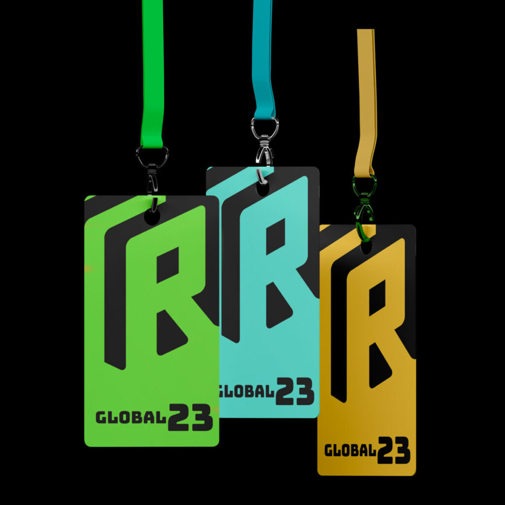
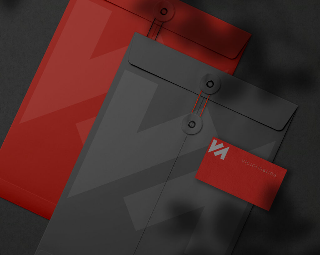
When designing your logo, it’s often best to work with a limited colour palette, typically two to three colours. A simple colour scheme can help create a more cohesive and visually appealing design, while also making your logo more versatile and easier to adapt to different applications.
6. USING COLOUR HARMONY PRINCIPLES
CREATING A BALANCED DESIGN
Colour harmony refers to the arrangement of colours in a visually pleasing and balanced manner. By using colour theory principles, such as complementary, analogous, or triadic colour schemes, you can create a harmonious and aesthetically appealing logo design.
7. TESTING YOUR COLOUR CHOICES
EVALUATING VERSATILITY AND IMPACT
Before finalising your logo colours, it’s important to test them in various settings and applications. Mock up your logo on different backgrounds, print materials, and digital platforms to ensure that the colours you’ve chosen are versatile and maintain their impact across different contexts.
8. CONSIDERING CULTURAL IMPLICATIONS
RESPECTING CULTURAL ASSOCIATIONS
When choosing colours for your logo, it’s crucial to consider cultural associations and potential implications, particularly if your brand targets an international audience. Colours can have vastly different meanings and associations depending on the culture and context in which they are used. For instance, in Western cultures, white is often associated with purity and cleanliness, while in some Eastern cultures, it is associated with mourning and death. Similarly, in Western cultures, the colour red is often associated with passion and excitement, while in some Asian cultures, it is associated with good luck and prosperity.
To ensure that your logo colours do not cause offence or miscommunication, it’s essential to research and understand the cultural context of the markets you’re targeting. This can involve consulting with local experts, conducting market research, and considering the specific cultural nuances and associations of the colours you’re considering.
In some cases, it may be necessary to adjust your colour choices to suit different cultural contexts. For example, Starbucks altered its logo for its operations in the Middle East by removing the iconic mermaid figure to avoid offending conservative customers.
Ultimately, the key to choosing culturally appropriate colours for your logo is to be aware of the cultural context and associations of the colours you’re considering. By doing so, you can ensure that your logo accurately reflects your brand identity while also respecting and resonating with your target audience.
9. STAYING AWARE OF DESIGN TRENDS
BALANCING TIMELESSNESS WITH CONTEMPORARY APPEAL
While it’s crucial to be aware of industry standards, being informed about current design trends can also be beneficial. However, ensure that your colour choices remain timeless and not solely based on passing trends.

10. PLANNING FOR FUTURE FLEXIBILITY
ENSURING ADAPTABILITY IN BRAND EVOLUTION
When designing a logo, it’s important to plan for future flexibility and potential changes in your brand’s direction or industry shifts. Your logo should be adaptable to reflect changes in your brand’s identity, products, or services without losing its recognisability and impact.
One way to ensure your logo remains adaptable is by choosing colours that can be easily incorporated into future iterations of your brand identity. This means avoiding colours that are too specific or trendy, as they may not be relevant or appropriate in the future. Instead, opt for colours that are timeless, versatile, and can adapt to changes in your brand’s direction.
Another way to ensure your logo remains flexible is to consider using a colour palette that can be expanded or adjusted as needed. This can involve choosing a primary colour that can be paired with complementary or analogous colours to create a harmonious and flexible colour scheme.
Additionally, it’s important to consider the potential impact of your logo colours in different applications, such as print, digital, and social media. Different colour combinations can have varying levels of impact and readability in different contexts, so it’s essential to test your logo in various settings to ensure its versatility.
By planning for future flexibility and adaptability, you can ensure that your logo remains effective and impactful for years to come, even as your brand evolves and changes.
11. SEEKING PROFESSIONAL HELP
CONSULTING A GRAPHIC DESIGNER OR BRANDING EXPERT
If you’re unsure about your colour choices or need guidance, consider consulting a professional graphic designer or branding expert. They can provide valuable insights into selecting the right colours for your logo based on your brand’s unique needs.
12. FAMOUS LOGOS AND THEIR USE OF COLOUR
LEARNING FROM ICONIC BRANDS
Famous logos can be a great source of inspiration when it comes to choosing colours for your own logo. Many iconic logos are recognisable, in part, because of their clever use of colour. For instance, Coca-Cola’s logo is famous for its use of the distinctive red and white colour scheme, while McDonald’s logo features the classic combination of red and yellow. These examples demonstrate how effective colour choices can greatly contribute to a logo’s recognisability and impact.
Conclusion
Choosing the right colours for your logo is a crucial step in building a strong and memorable brand identity. By considering the psychology of colour, industry standards, and the principles of colour harmony, you can create a logo that effectively communicates your brand’s personality and resonates with your target audience.
Remember to test your colour choices and ensure their accessibility, readability, and cultural appropriateness to create a truly successful logo design. If in doubt, don’t hesitate to seek professional advice from a graphic designer or branding expert.